

Autopedia
A website that eases the process of understanding, consolidates, and compares complicated Advanced Driver Assistance Systems (ADAS) in vehicles.
Tufts University Senior Capstone Project
Spring 2021
Project Overview

Project Scope: End-to-end Website, Branding
Role: Project Manager, Visual and Interaction Designer
Team: Class peers—UX Researchers, Visual and Interaction Designers
Project Start Date: January 2021
Project Duration: 5 months
Methods: User Research, Competitive Research, Wireframing, Usability Testing, Prototyping
Tools: Figma, Adobe Photoshop
Context
Advanced Driver Assistance Systems (ADAS) are technologies and features designed to improve driver safety and convenience by providing assistance in controlling the vehicle and alerting the driver to potential hazards. Examples of ADAS include lane assist, cruise control, and park assist.
Challenge
Over the years, ADAS in vehicles has grown increasingly popular (not to mention necessary), meaning tons of these new systems are being developed and introduced in vehicles every year. Thus, it becomes nearly impossible to keep track of all of these features, how they operate, and what they do.
Our client, Professor Hal Miller-Jacobs, has requested an interface to synthesize these features, as well as provide insight into how they operate, and how they compare to similar features in other vehicles.
Objectives
Create an end-to-end interface to synthesize and compare the existing ADAS safety features across car companies
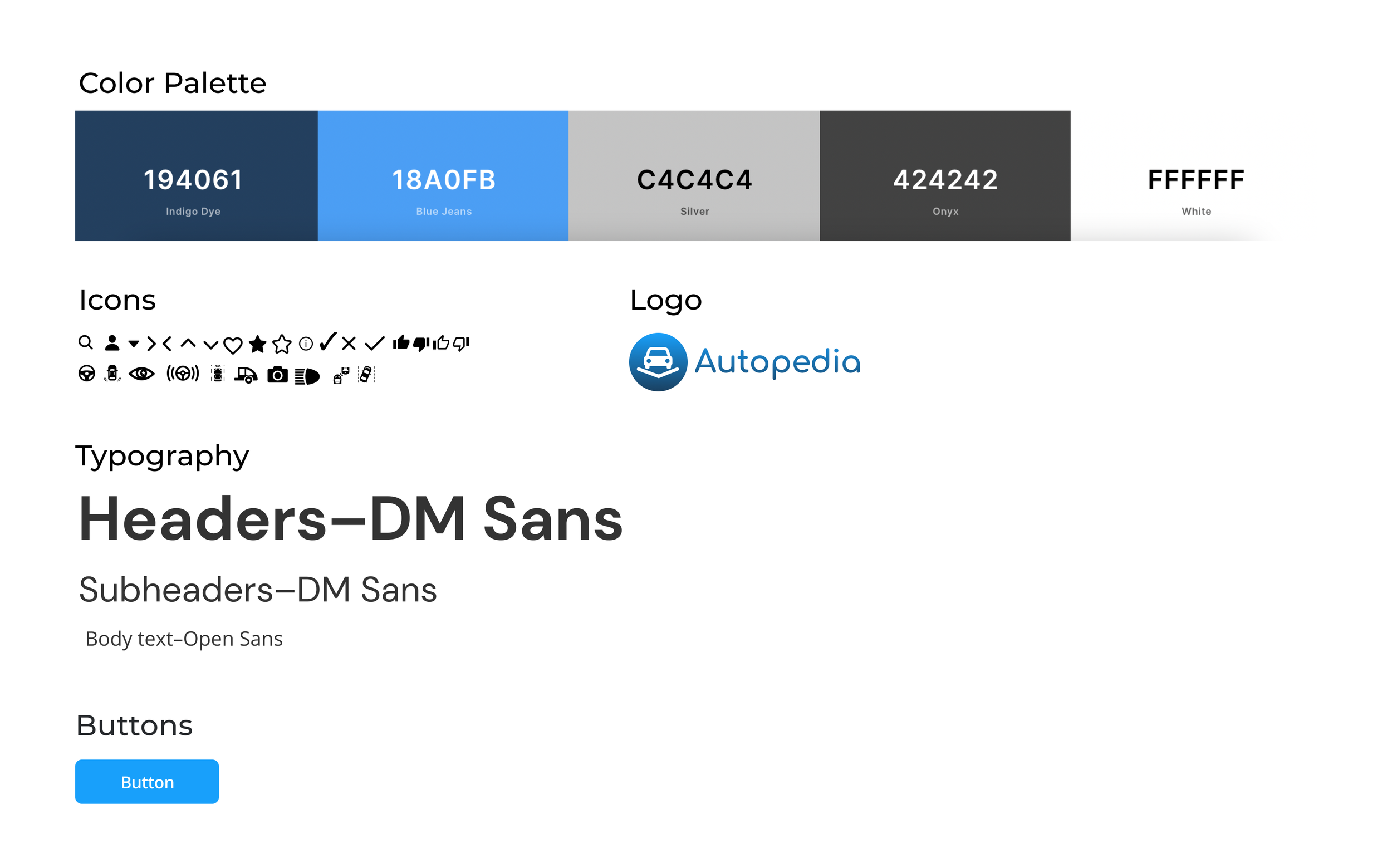
Create a comprehensive style guide—complete with logo and branding—to appropriately accompany the interface
My Process
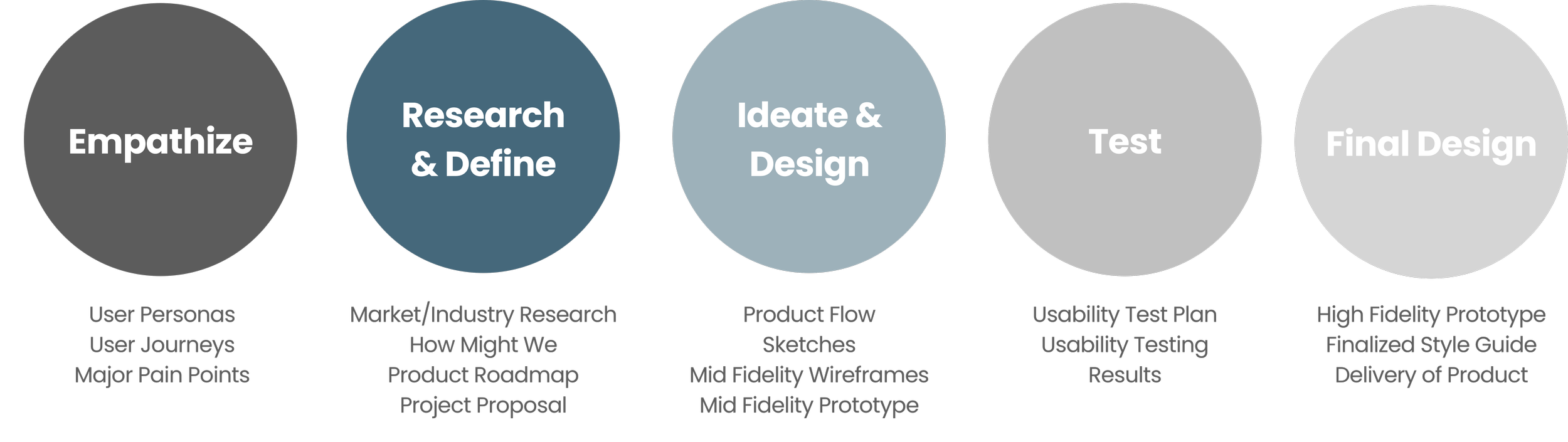
Please refer to our Gantt Chart to view a comprehensive overview of the project timeline.
Empathize
In order to understand the problems, we need to understand the users
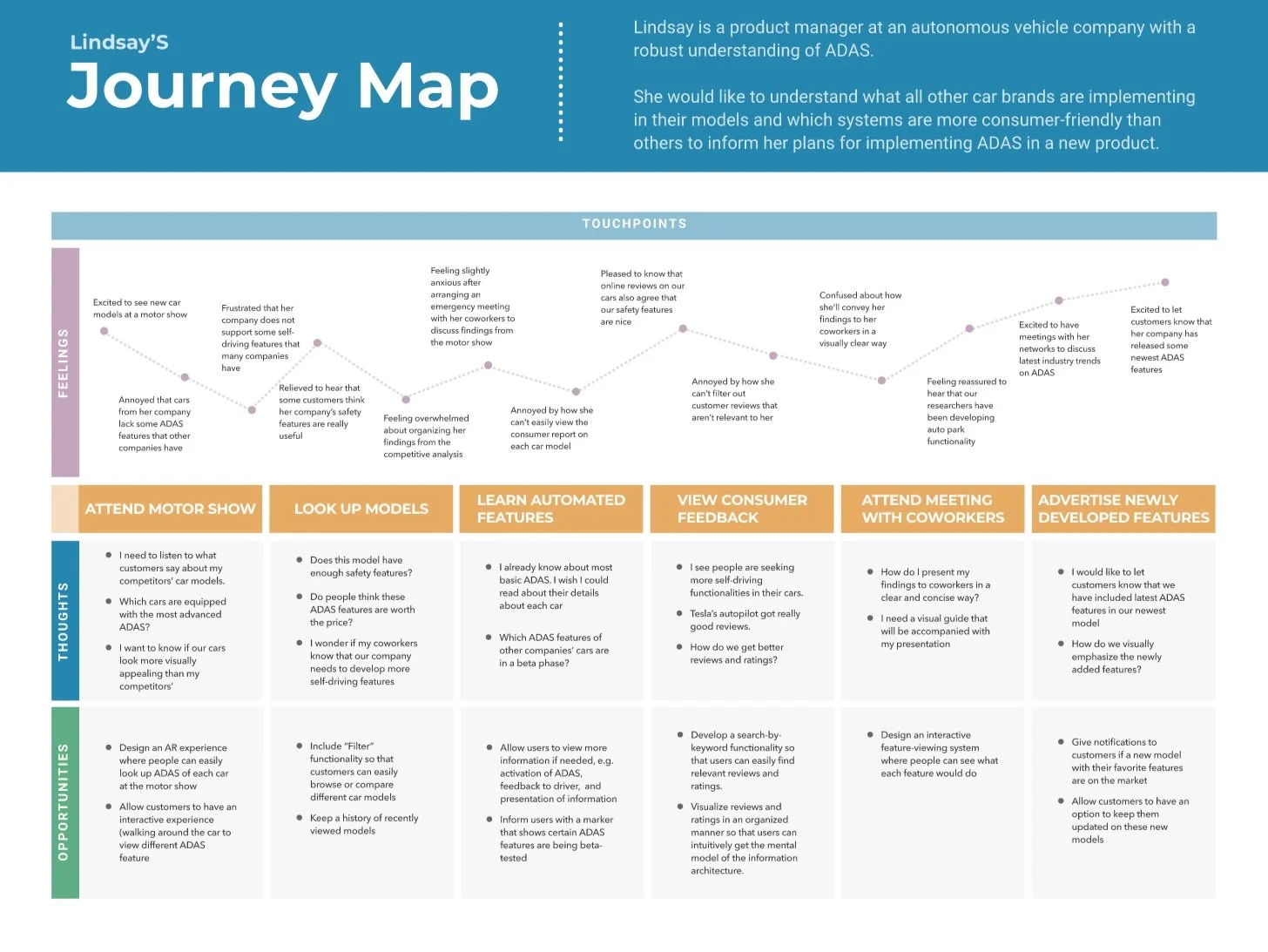
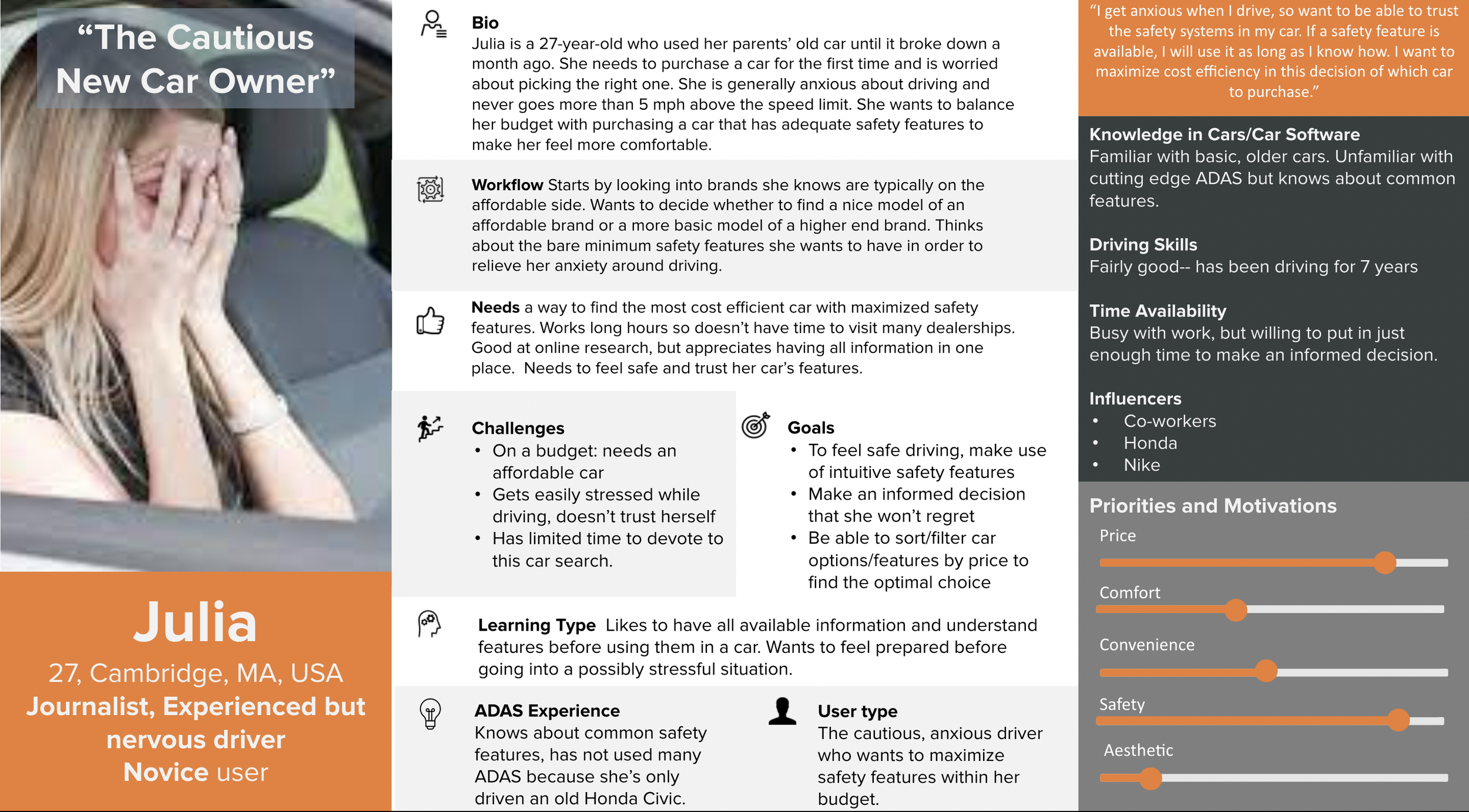
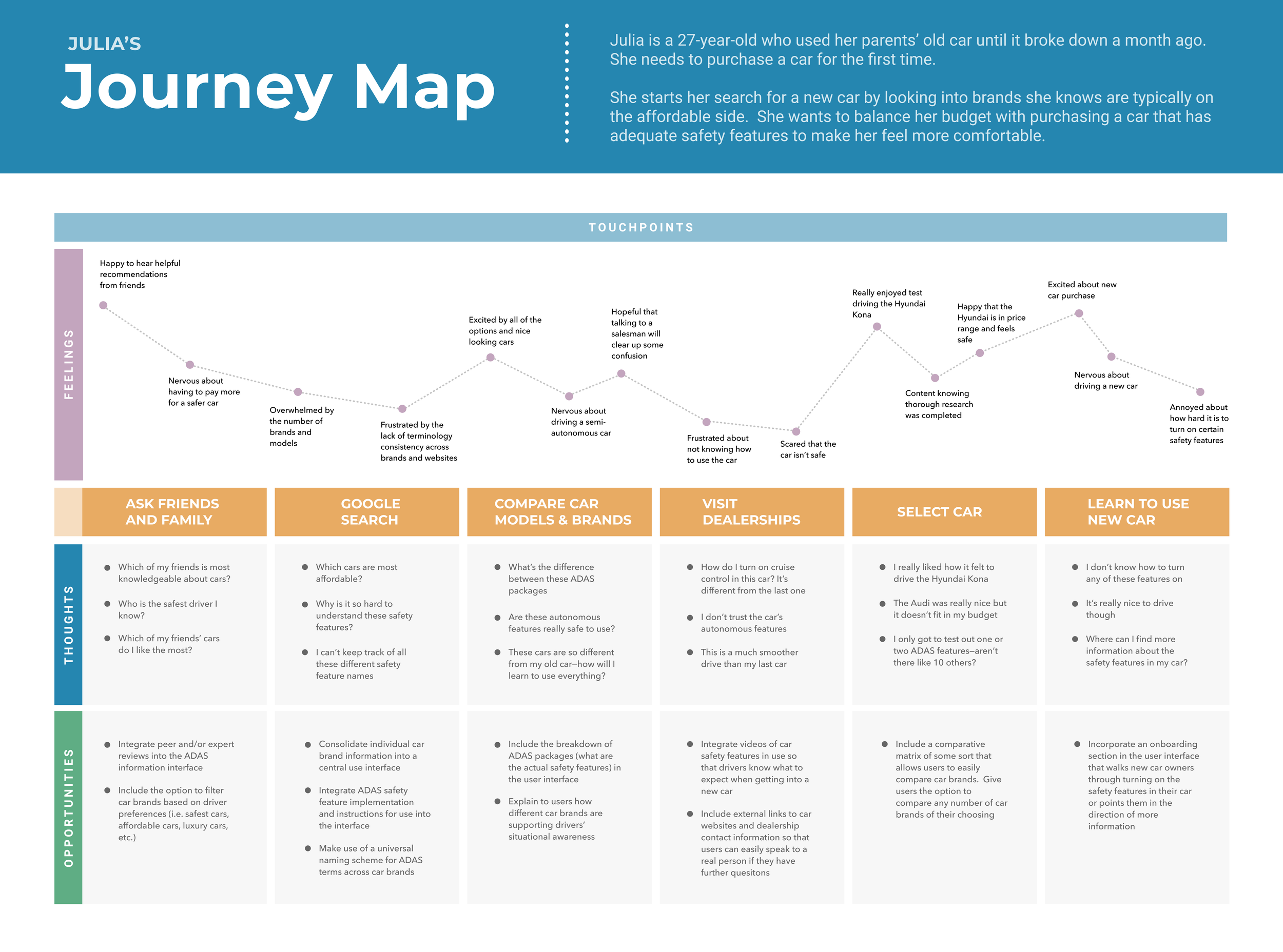
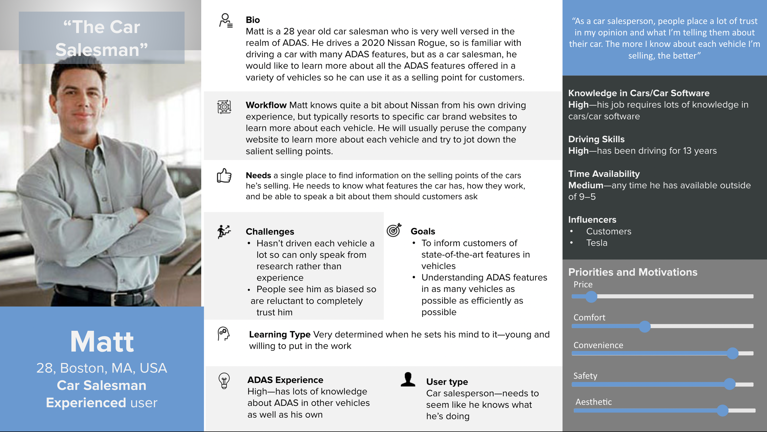
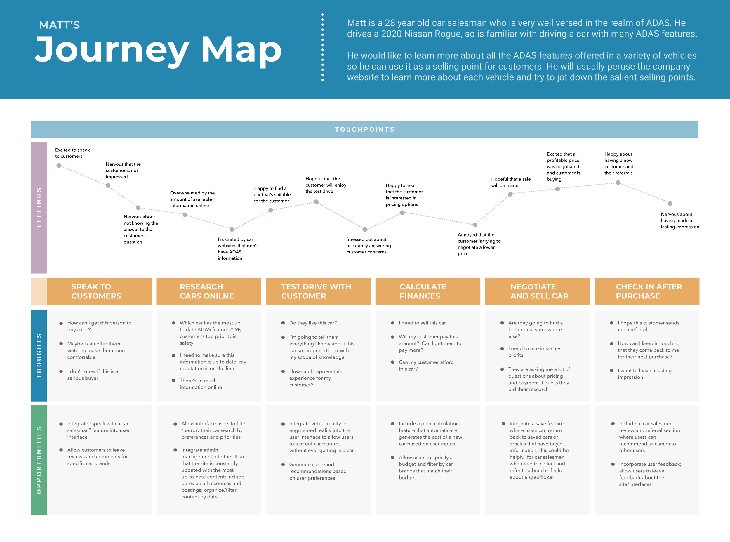
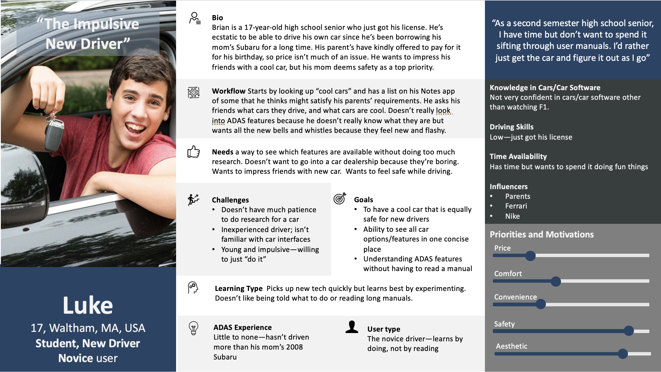
User Personas and Their User Journeys
User personas helped us create realistic representations of our users to understand their needs (both obvious and latent), experiences, goals, desires, and behaviors. Each persona has a respective user journey, that helped us understand how a certain user persona would need to use the platform we are designing. The visualization of steps a user takes when interacting with a product or service—from initial awareness to post-use evaluation—aided us in highlighting potential pain points, and where to focus our energy in the final design.

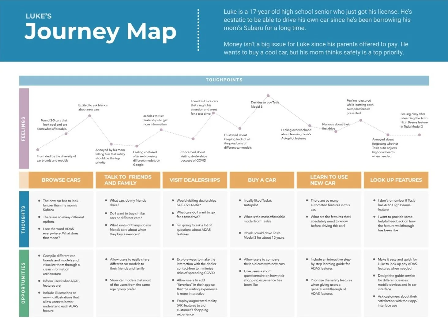
Focused Users
We opted to narrow our project scope to address the needs of our two primary users: Julia, the cautious new car owner, and Lindsay, the autonomous vehicle employee. With this in mind, we addressed the aspirations and workflows of these two personas.

Wants a quick way to learn about most cost efficient car with maximized safety features
Looks for quick explanations and resources for cost efficient and safe cars that she can trust
Workflow:
Asks friends and family about cars
Searches for more information (e.g. price, safety features) on Google
Compares different car models
Visits dealerships to see how to operate autonomous features
Buys a car
Learns how to drive a new car and operate autonomous features
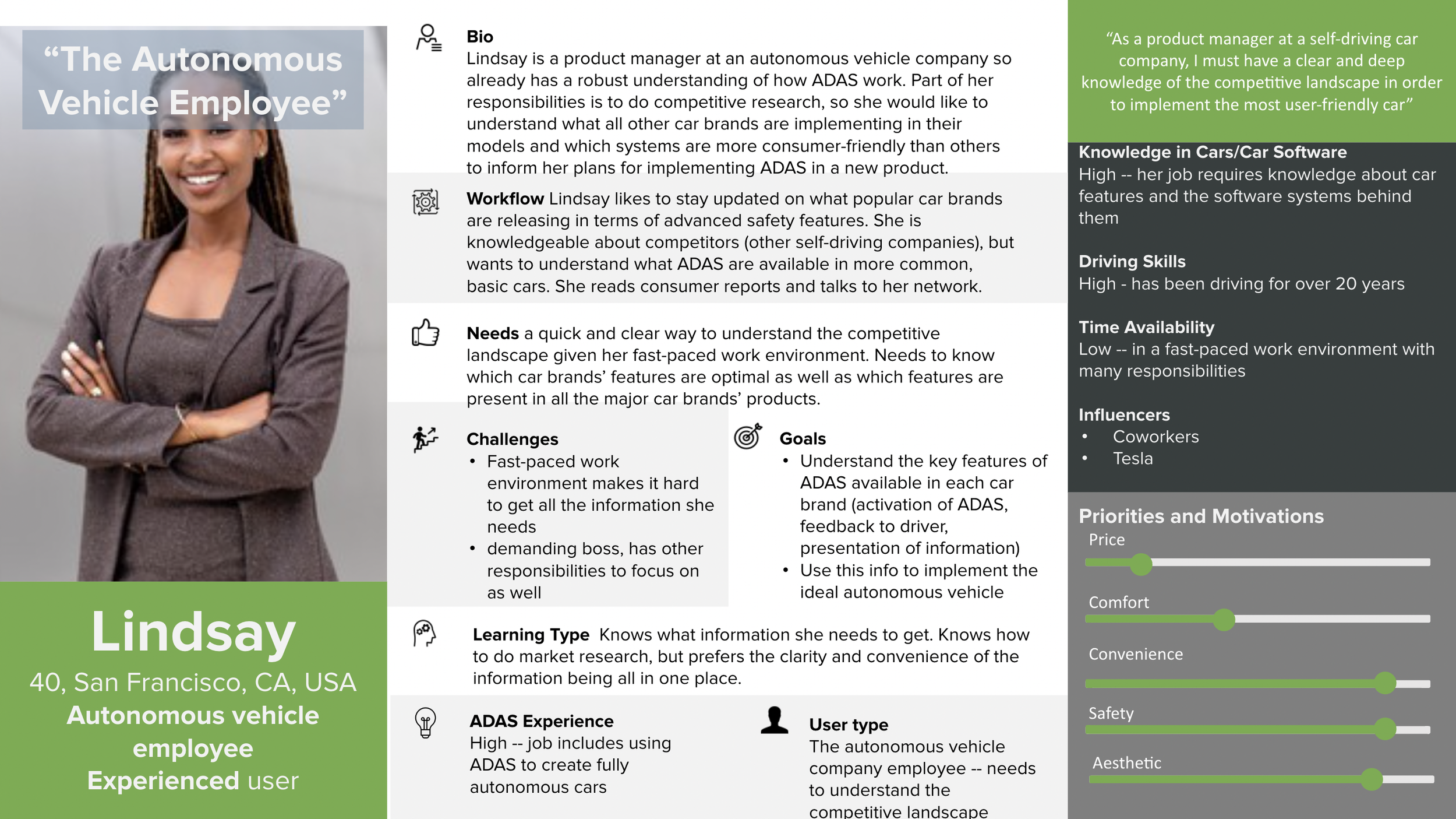
Wants a quick and clear way to understand her competitive landscape
Looks for which car brands’ features are optimal as well as which features are present in all the major car brands’ products
Workflow:
Compiles latest information about competitors’ autonomous features
Looks for more detailed description on each safety feature
Views consumer feedback on operating autonomous features
Organizes her findings in a visually clear format
Holds meetings to discuss how to optimize autonomous features based on user needs
: Pain Points
Research & Define
What information do we need? What are the problems we are trying to solve?
In order to create an interface that would synthesize ADAS information, we as researchers and designers first needed to understand the general nature of ADAS. This stage of the design process required ample research and understanding before we could define the problem statement and scope of our project.
Market & Industry Research
Our research team conducted a deep dive into current publications, studies, tests, and articles to consolidate the most common ADAS in cars—including specific examples of their use—and cross compared them with other vehicle brands and models. The resulting document became the backbone of our final interface, which aimed to collect, organize, and inform our user about this data.
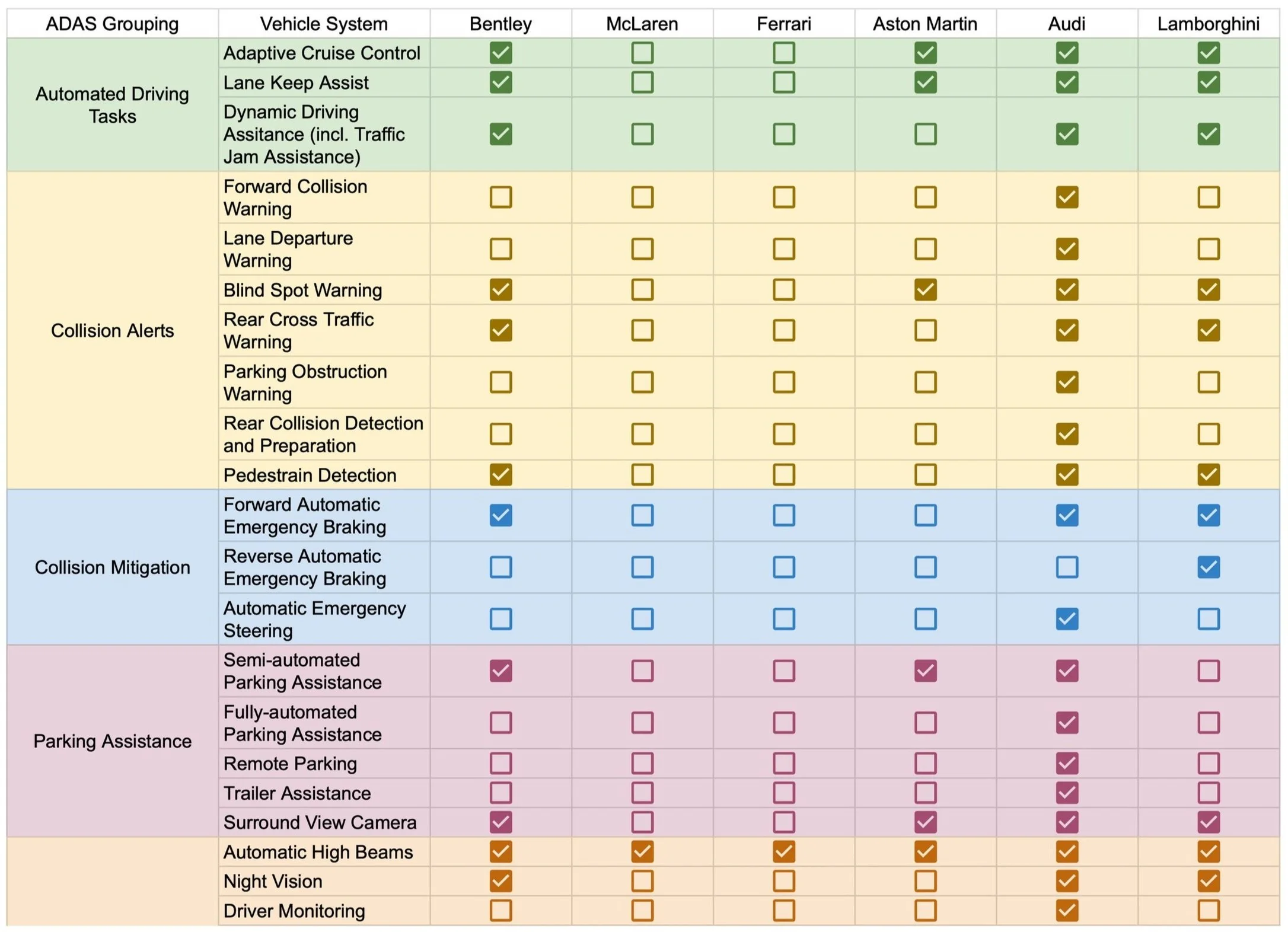
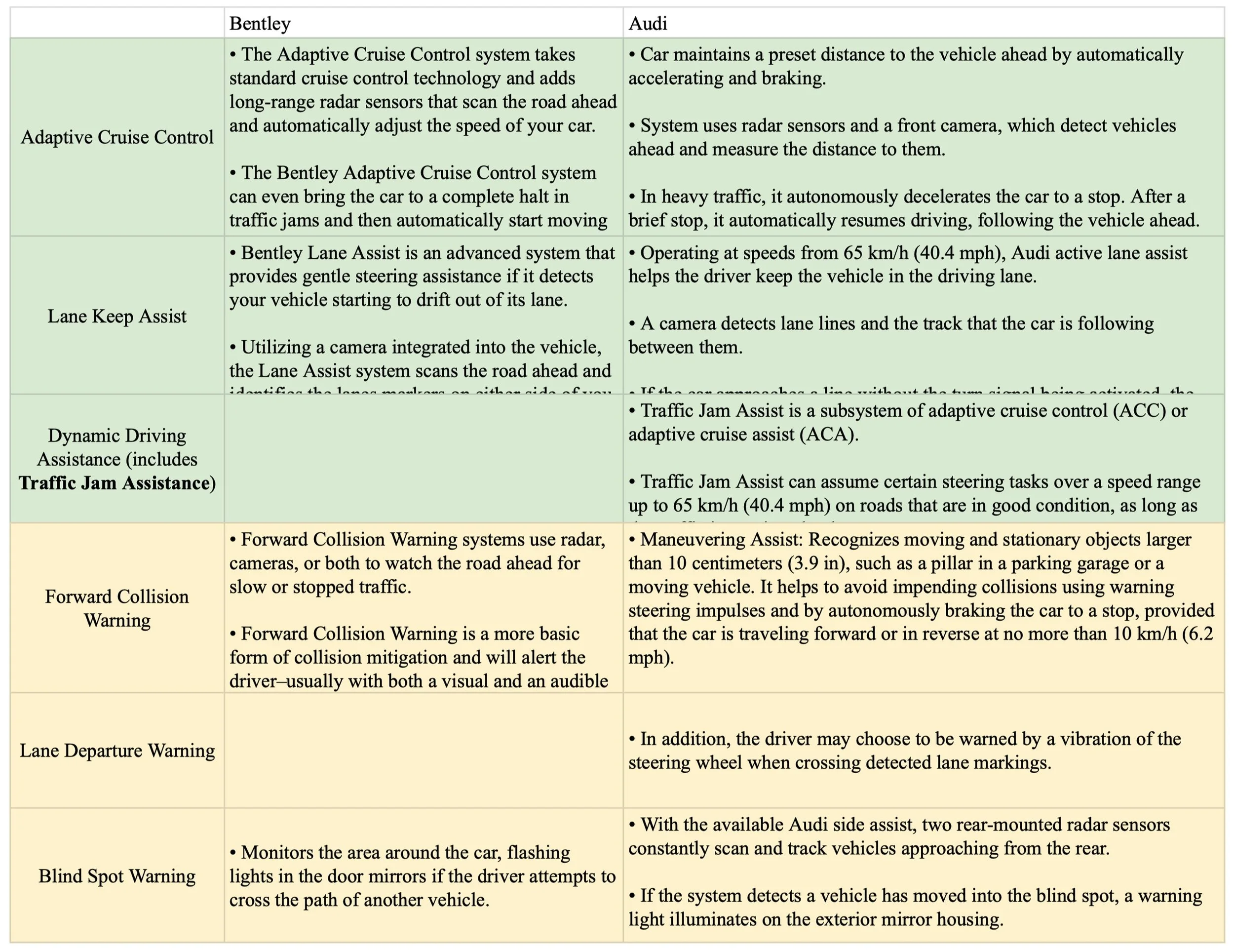
Through this exercise, it became evident just how necessary an interface with consolidated data would be for our users. We found that not only were there hundreds of ADAS available across different car brands, we also found that the same ADAS in one car often went by a different name in another car. This pushed us to create consistent, uniform language that we could use across the board to make it easy for our user to focus on what was important: the actual system and its use, rather than the many names by which it could be referred to.
Through our persona research, preliminary research, and discussions with potential users, we discovered that the three most valuable features of the interface would be to:
Understand ADAS, what they do, and how they work
Discover which cars utilized which ADAS
Compare ADAS in different cars
Once we had identified the main goals and scope of our project, we formed our “How might we” statement to reframe the problem as an opportunity for creativity.
How might we….
synthesize current information about different implementations of Advanced Driver Assistance Systems to create a centralized user interface for it?
Once our research team had compiled an exhaustive report of existing ADAS, how they work, and cross-compared them with ADAS in other vehicles, the next step was to present this information in a user friendly way. We planned to design a desktop interface to serve as a centralized location for information about commercialized ADAS functionality. This would ultimately providing users a space to learn more about what ADAS is, browse cars and see what features each make and model has, and compare across different car brands to find their perfect car based on their preferences.
Product Roadmap
Once we had defined the main goals of the interface, we started to map out the features and functionalities that would help us get there. We put together a list of features categorized by priority, with guidance from both our personas and the client, to get started.
Must Haves:
ADAS dashboard
Ability to search for specific ADAS
Details page to understand how specific ADAS works and how it’s implemented
Cross comparison of ADAS in other cars
Nice to Haves:
Ratings on certain ADAS and cars
Navigation to relevant car websites
Ability to set and save preferences
Ability to filter for price, ADAS, rating, etc.
Project Proposal
After mapping out the rest of the project, we created a final Project Proposal for our client, Mr. Miller-Jacobs. This proposal incorporated the following sections:
Introduction:
Summary of Client
Summary of the Problem
Purpose Statement
Project Scope
Project Approach:
Overall research Plan/Vision
Areas of Interest / Individuals of Interest
Information Collection Approach
Anticipated Challenges
Team Information:
Team Roles and Technical Capability
Communication and working methods
Schedule and Budget:
Schedule
Rough budget
Ideate and Design
How can we design a solution to the user’s problems?
Once we had an established list of priorities for the interface, we put together a product flow to visualize the experience from the user’s perspective before we started sketching, wireframing, and prototyping.
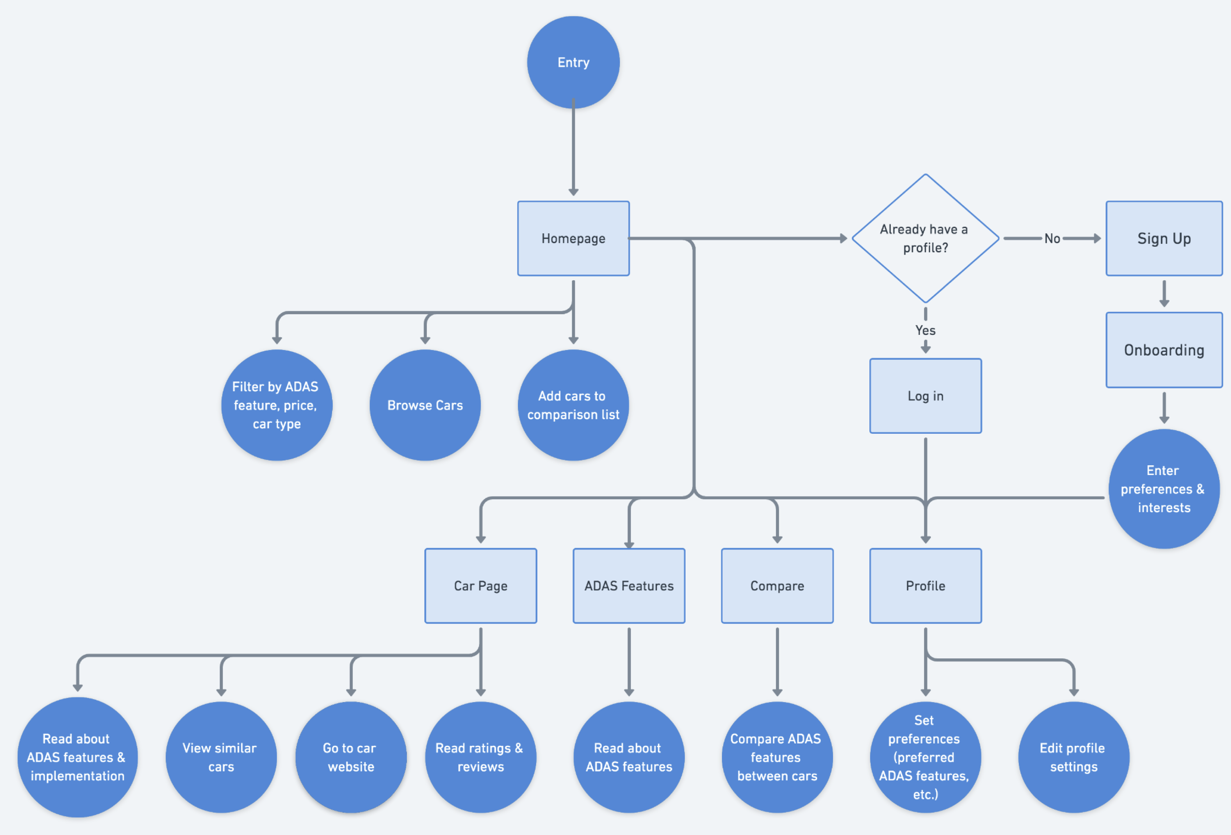
Product Flow
With our user needs in mind, we worked to identify which features and functionality to include in our final interface. We needed to ensure that our website would be intelligible and usable by both novice and experienced users. Building a product flow helped us map out the user journey and identify potential pain points, gaps, or areas for improvement in the user experience. Being able to visualize the user’s touchpoints and respective decision-making was immensely helpful when creating our final screens.
Sketches
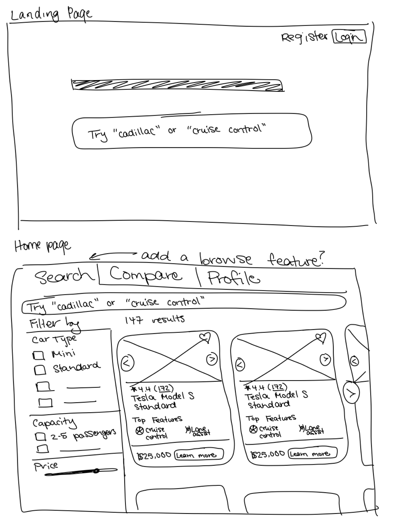
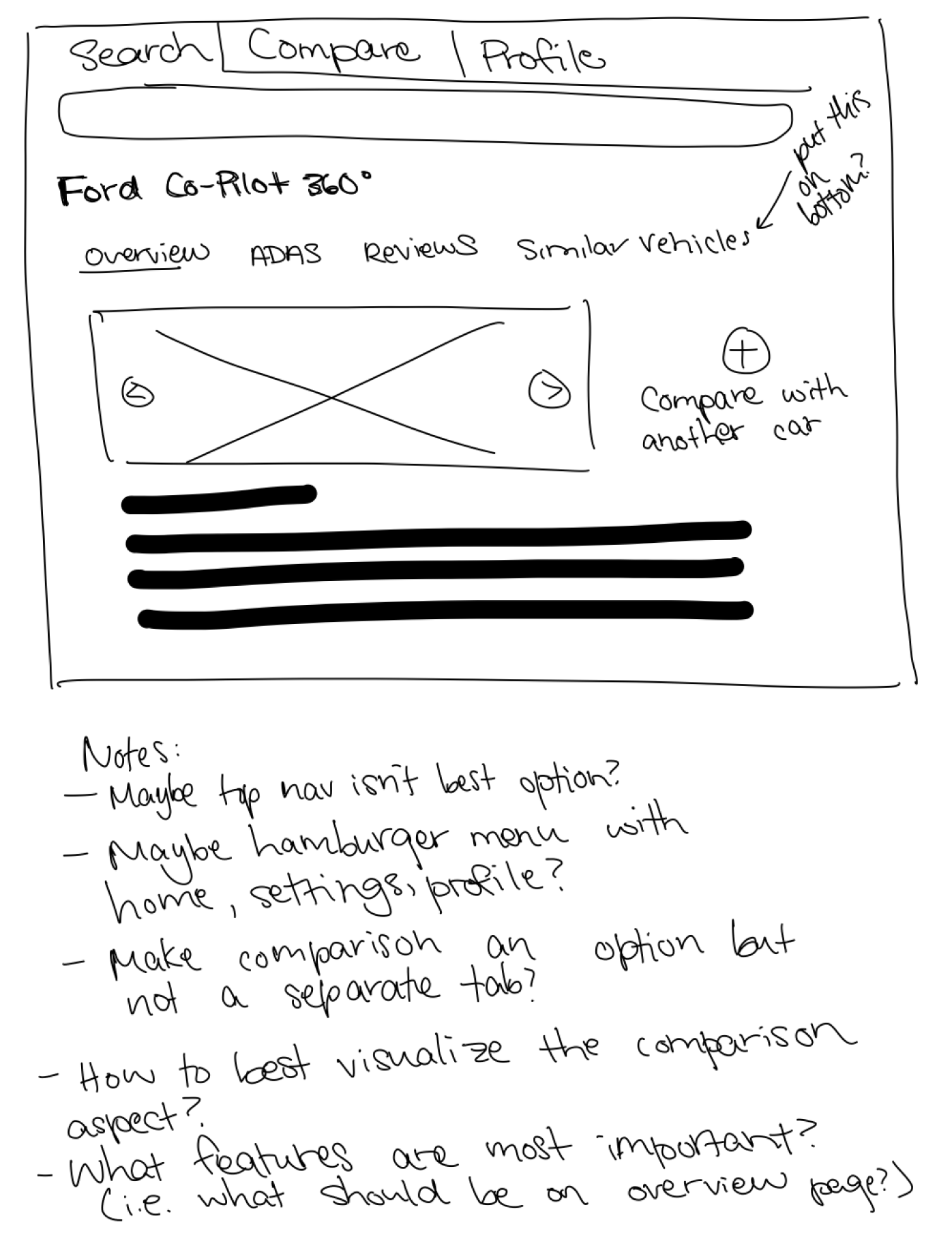
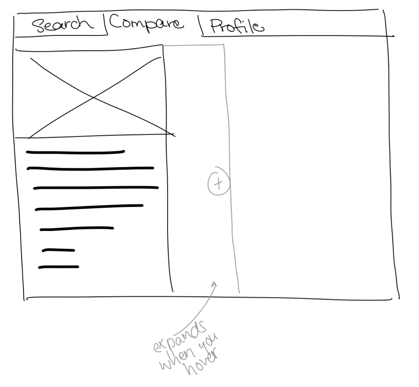
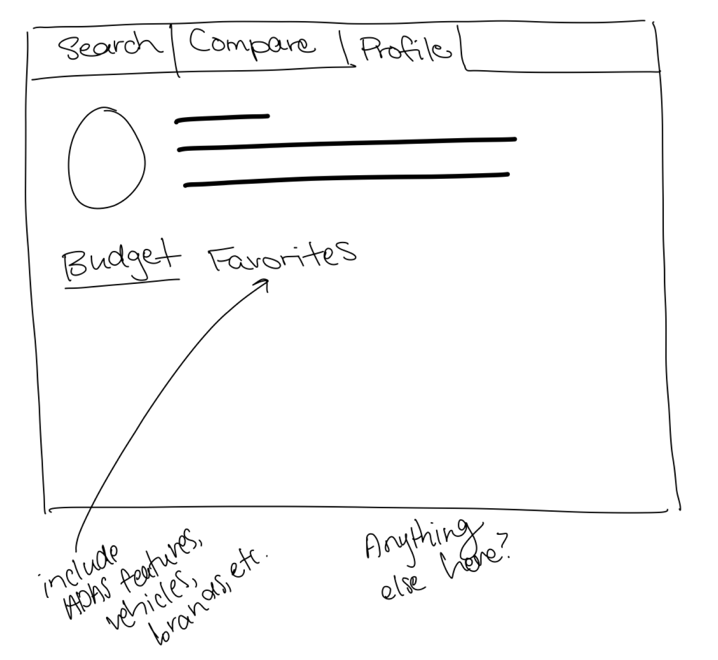
The primary goal for the sketch phase was to get all my ideas on paper—or iPad in this case—it wasn’t intended to be clean at all. In fact, at this point, I was looking for quantity over quality. I experimented with different layouts for the landing page, the dashboard, the car/ADAS comparison page, and the user profile. Sketching my thoughts on my iPad gave me an idea of how my ideas would look without having to commit to anything.
Mid Fidelity Wireframes / Prototype
Once we had a good idea of the design direction we wanted to go in, we got to work creating mid fidelity wireframes. Mid fidelity wireframes allowed us to explore content and layout without getting into the specifics of visual design. We knew the next step of the design process was to test this prototype, so we wanted to create wireframes that were polished enough that they seemed realistic, but not so polished that we were bogged down by having to refine frivolous changes when iterating.
Usability Testing
How well does the interface achieve its main goal? How easy is it to use? Is it intuitive?
Usability Test Prep
Once we had a pretty well functioning prototype, it was time to get it in front of users for feedback. My team compiled a list of potential test subjects—a mix of both novice and experienced users—who would be able to provide us the most valuable feedback. Once we had recruited six subjects, we worked on a script and usability test plan. We tested with the following people:
Breakdown of Test Subjects:
6 users
Users’ ages ranged from early 20s to 50s
Mix of male and female participants
Breakdown of Testing Tasks:
Browse car models based on ADAS features, price, car companies, etc.
Browse and learn about specific ADAS features
Compare different models/companies based on ADAS features
Search for specific models and learn about the ADAS features that they have
Learn about the implementation of ADAS features within a given model and how well these features are ranked/reviewed
Usability Test Results
After conducting six one-hour remote usability sessions, we walked away with invaluable feedback. We recorded each session, and made notes of mistakes, frustrations, slips, successes, and questions that each user had and documented them in a comprehensive data sheet.
Three main themes we took away from testing were:
Users want explanations of ADAS in layman terms
Users want to understand the implementation of ADAS in specific vehicles, not just generally
Users want personalization when it comes to selecting “favorites” or presets
Final Design
How can we make it look and feel like the real thing?
At this point, we were ready to design the final high-fidelity prototype. We had incorporated the feedback from testing, and utilizing our style guide, created an interface in accordance with our decided branding.
Autopedia
The website that eases the process of understanding, consolidates, and compares complicated Advanced Driver Assistance Systems (ADAS) in vehicles.
View the final presentation to the client.
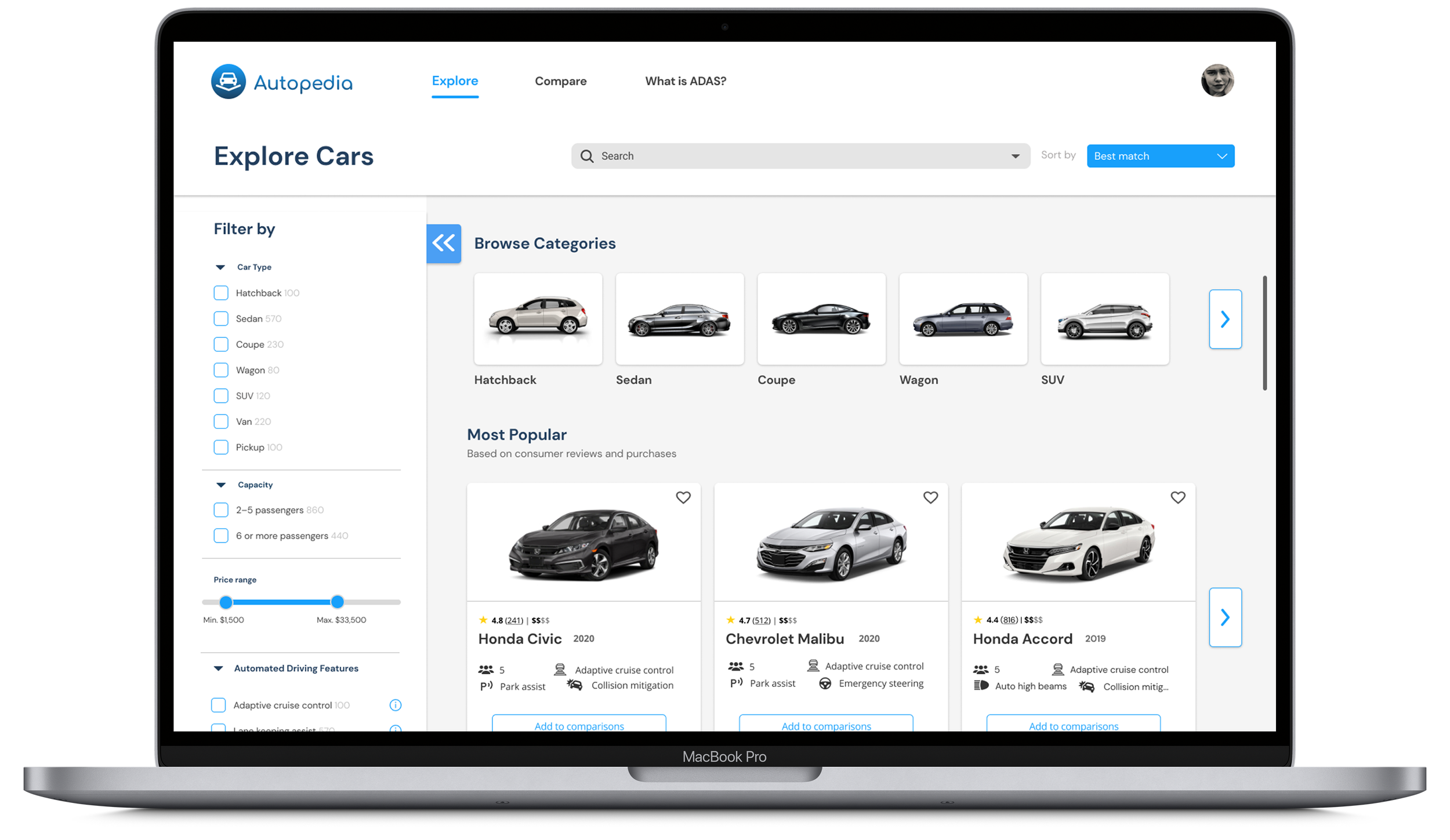
Final Landing Page Design
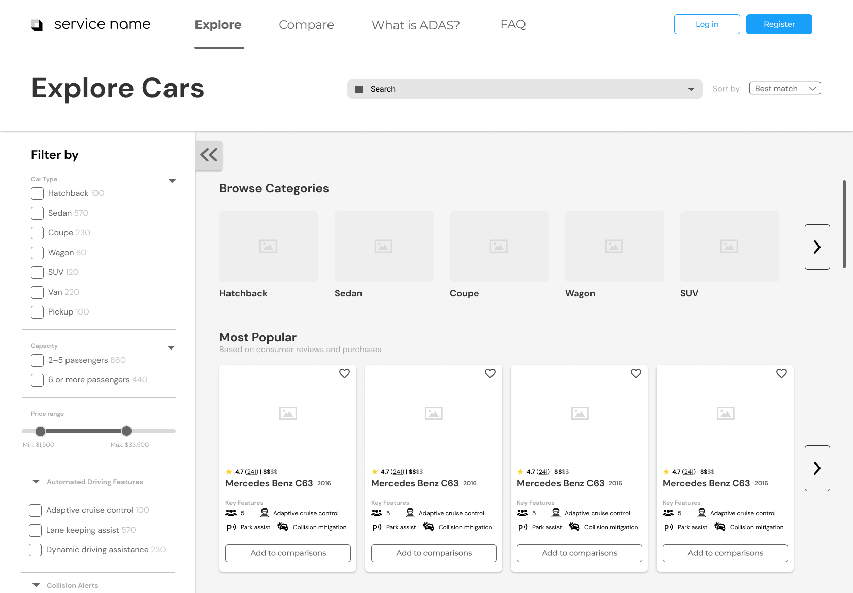
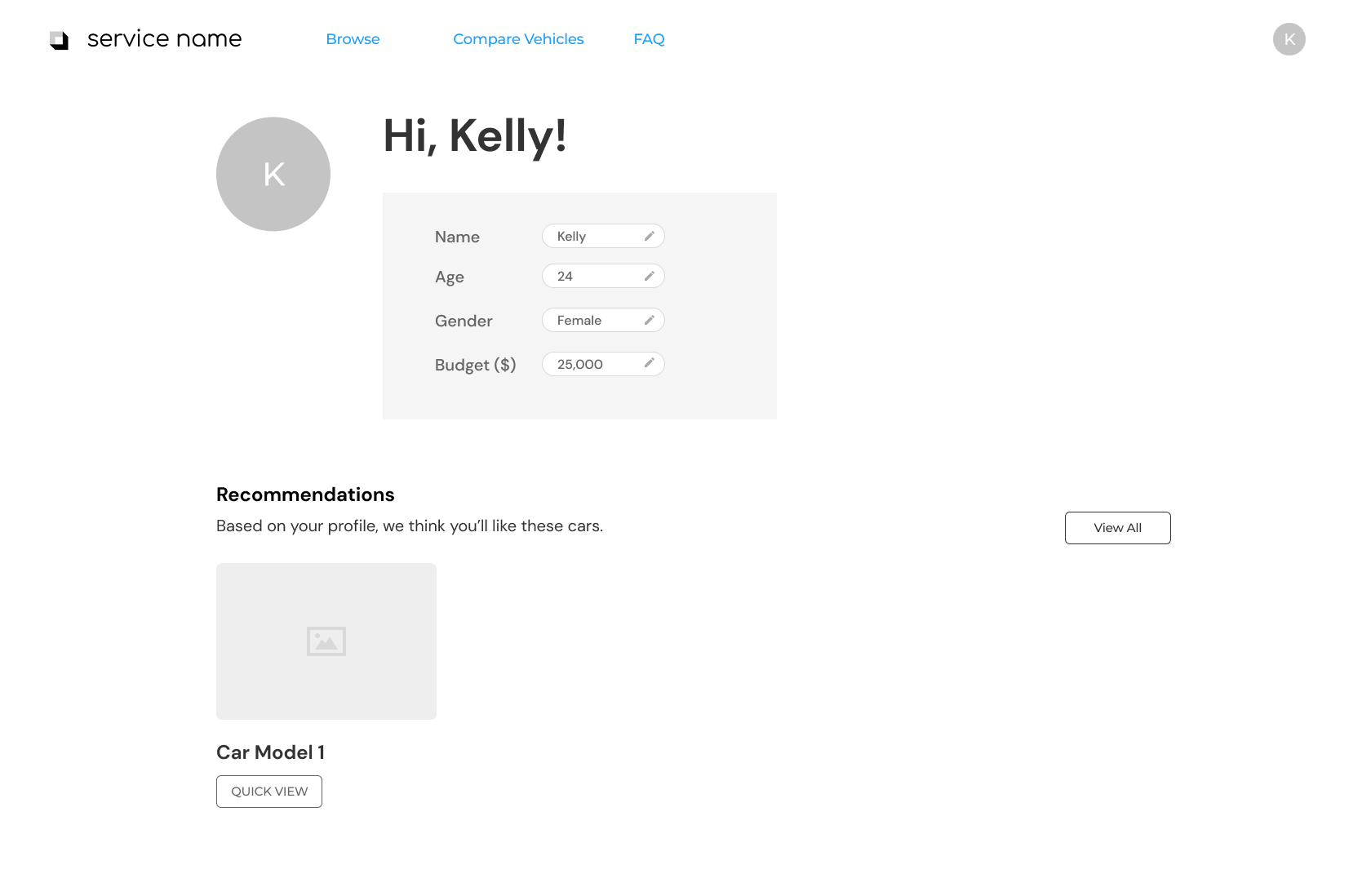
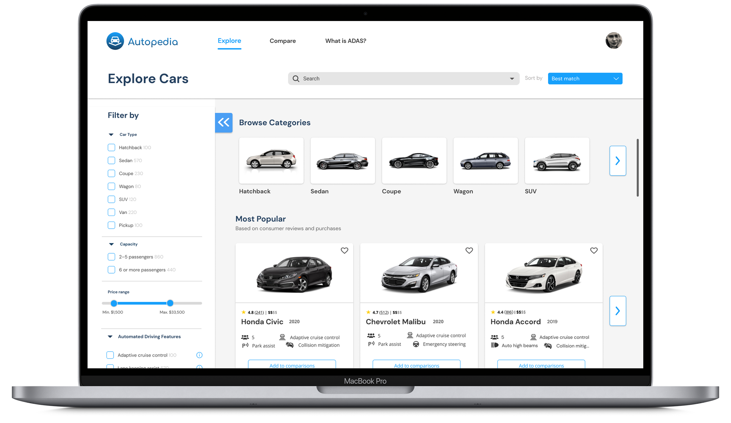
Based on our discussions with the client and our user persona research, we knew there were going to be a good amount of both novice and experienced users using our platform. Thus, it was crucial that we built a dashboard that catered to both. By providing plenty of filter, sort, and search functionalities, we made the dashboard digestible for our users. However, if our user didn’t know what to search for yet, we wanted to provide them a discovery page where they could explore all cars.
Compare Cars and Features
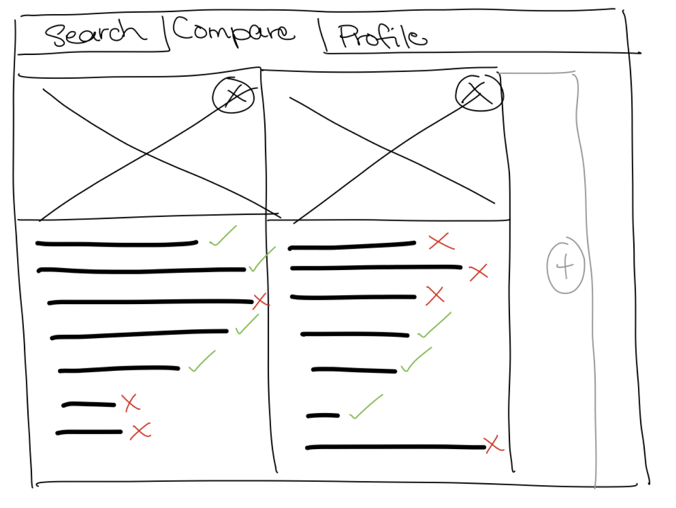
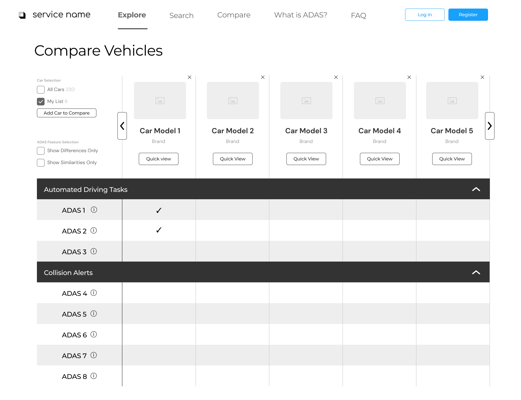
One of the most important aspects of our site was its ability to compare cars and the ADAS within them, so the user could make educated decisions about what car would be the best fit for them. In order to make this possible, we needed to present large amounts of information without overwhelming our user. Research suggests that people can’t compare more than five items at a time, so we decided to limit the comparison page to displaying five cars at a time.
We conducted market research on successful comparison UIs to get a better sense of how to reduce the cognitive load for users needing to process and compare large amounts of information. By giving users the freedom to collapse and expand certain ADAS categories, as well as tooltips to remind users of feature definitions, we hoped to further limit the amount of information the user need to process at one time.
Detail Pages
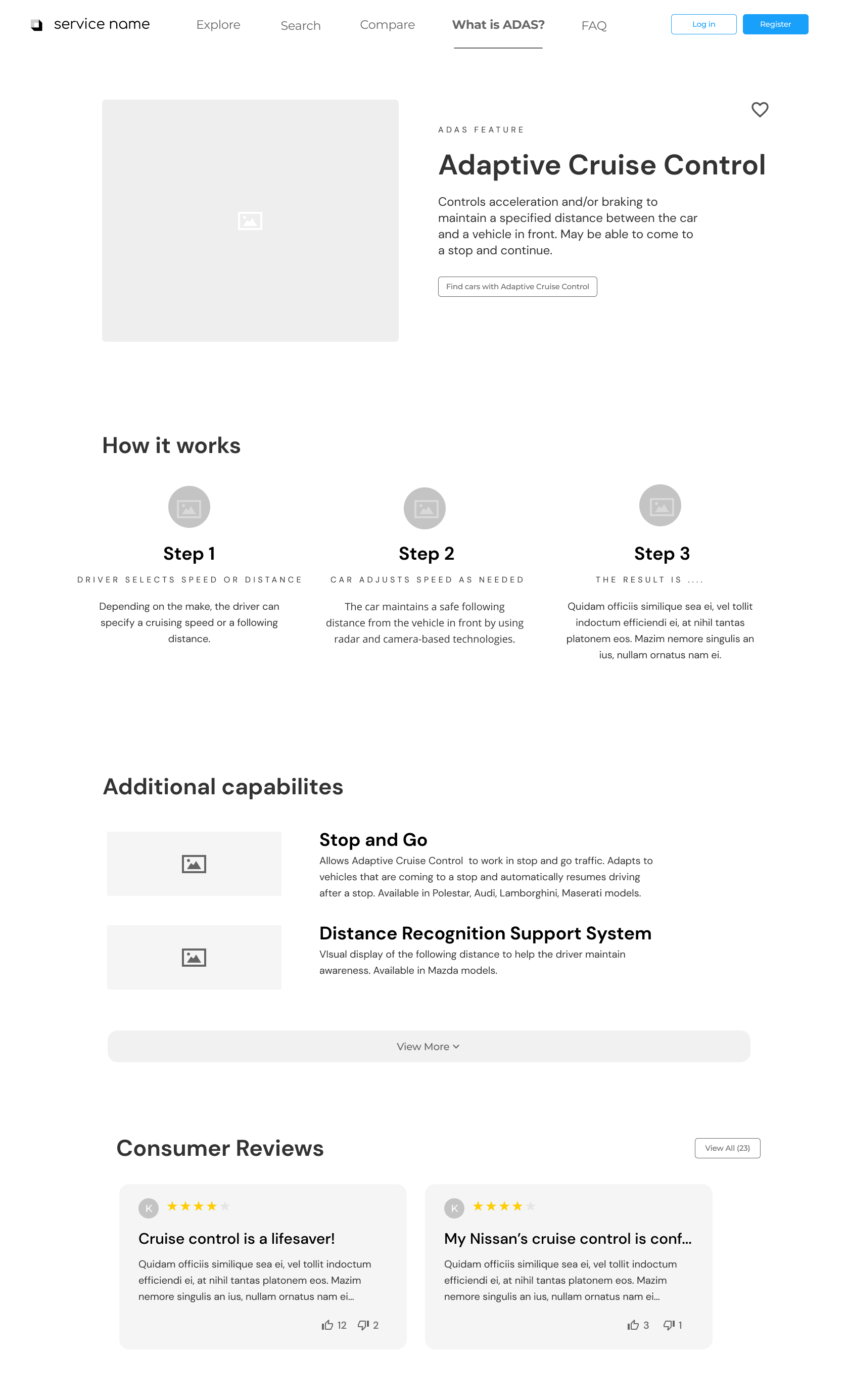
One of the most useful aspects of our website aimed to inform the user of specific features and how they worked, as well as which features were available in a certain car, so we developed two details pages that highlighted this information. The ADAS detail page, sampled on the left, highlights the universal name of the feature, how it works, reviews, as well as cars with that feature.
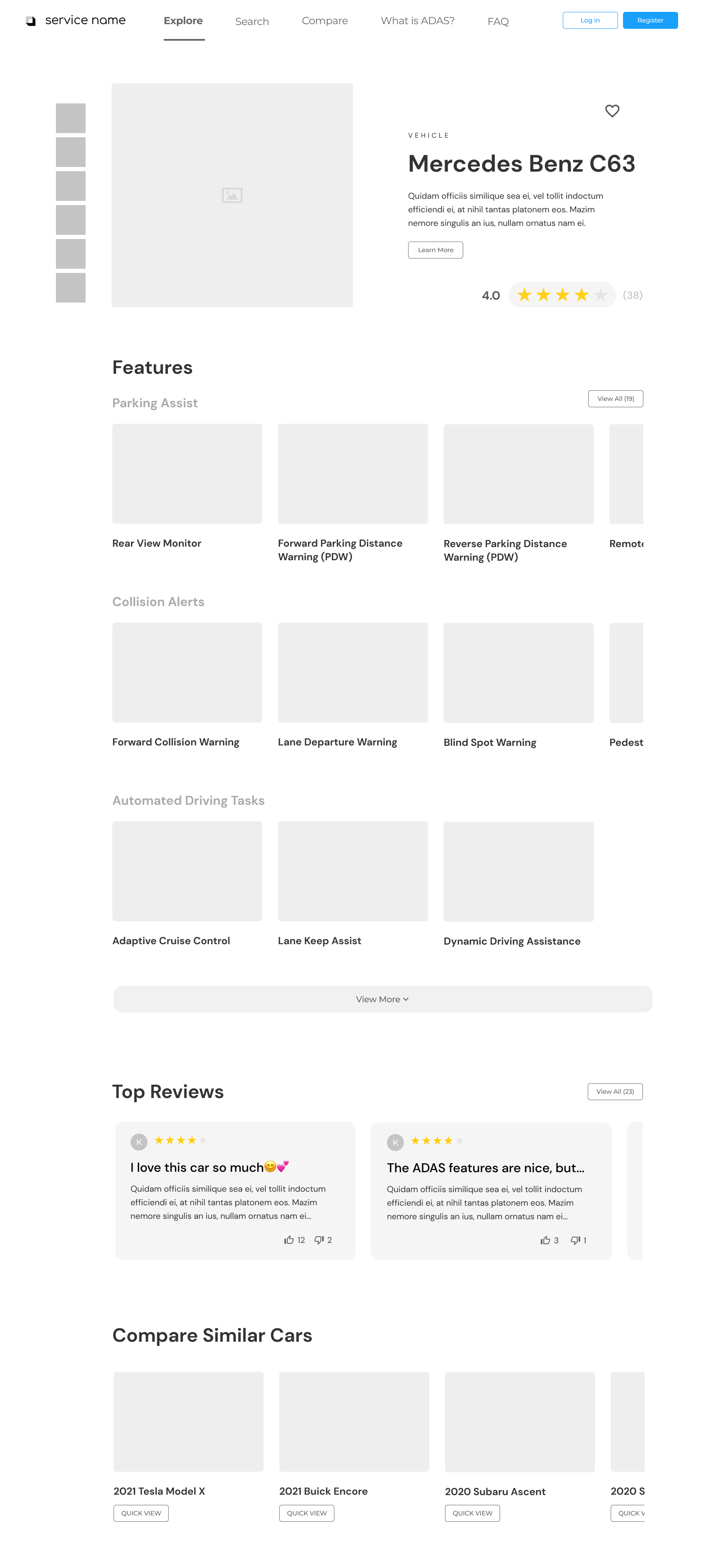
The car detail page, sampled on the right, highlights the car make, a description of the car, the price, reviews, an overview of ADAS—organized by category—found in the car, as well as a collection of similar cars with which the user can compare. From the car detail page, the user can click into any of the ADAS and be taken to its detail page to learn more about that specific feature.
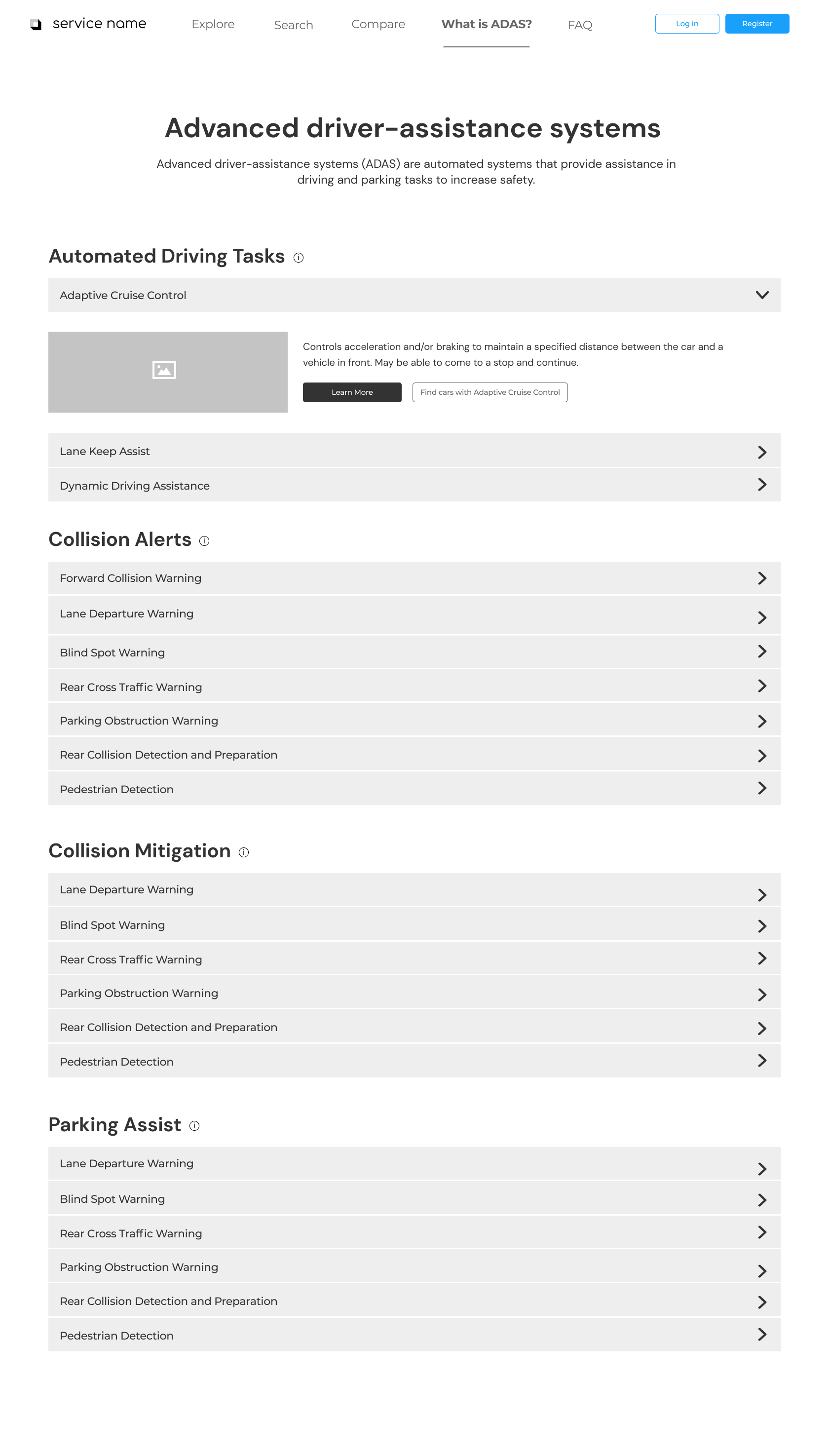
“What is ADAS?” Page
Through our research and testing, we found that providing users with the ADAS in each car wasn’t sufficient; users needed a page dedicated solely to understanding all ADAS available and how they work. This aimed to solve a crucial part of the problem we were solving, which was to inform drivers about ADAS and help them to use the safety features in their own cars. It also helped users identify which ADAS they found most valuable in vehicles, and ultimately shaped the way they shopped for cars.
Challenges and Takeaways
What did I learn from this experience?
This was one of the most rewarding projects I worked on in college. Working with an actual client on a semester-long project with a group of student researchers and designers gave me a glimpse into life as a UX designer, and ultimately helped shape the path I chose post-grad.
As the project manager and one of the lead designers, I gained practice and confidence in planning and organization, communication, leadership, risk management, budget and time management, conflict resolution, problem solving, attention to detail, and adaptability, among other skills. I plan to continue bolstering these skills in future projects.
With the wins, however, came some struggles. This project gave me a greater appreciation for the effort it takes to work well in a large group. Coordinating around each team member’s busy schedule and evenly dividing up the tasks was definitely a challenge. Furthermore, it taught me the importance of converging on a concrete problem statement. Early on in this project, we realized that our problem statement gave us too much flexibility with regards to what direction to explore. This flexibility proved difficult to navigate because we ended up changing our focus several times. However, clear communication across all our teams helped us ultimately get on the same page to narrow our focus and move forward.
Next Steps
While this project was only one semester, we identified some high priority areas that we would focus on should we continue working on it. The obvious one is to actually create this website. There is obviously a gap in the market and a need for it, so to develop it fully would be invaluable. Secondly, our website could lend itself well to represent the ADAS features of a specific car brand, allowing users to explore different safety systems from a single brand, rather than across the board. And lastly, we’d want to develop an easy solution to maintain the database so it is up to date with the release of new ADAS.
View My Other Projects
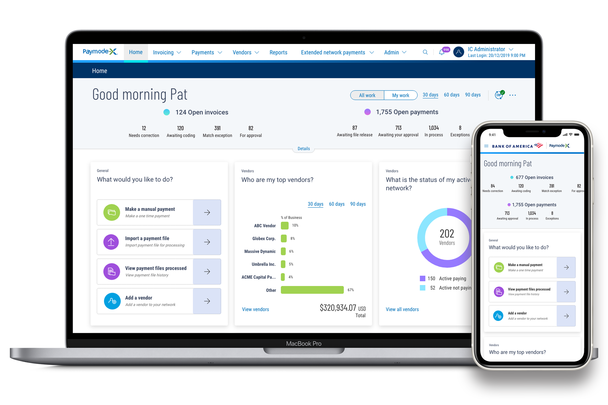
Paymode-X Payer Mobile App
End-to-end Mobile Application | Marketing
MentorMe
End-to-end Mobile Application | Branding
Paymode-X Homepage Redesign
Desktop Redesign