

MentorMe
The app that pairs you with your perfect mentor or mentee based on your needs, on your terms.
UX Design Challenge
Spring 2020
Project Overview

Project Scope: End-to-end Mobile App, Branding
Role: Principal UX Designer
Project Start Date: February 2020
Project Duration: 1 week
Methods: User Research, Usability Testing, Surveys, Prototyping, Wireframing, Competitive Research
Tools: Sketch, Adobe Photoshop, Qualtrics
Context
The client school wants to strengthen the community by encouraging experienced students to connect with new students and help them adjust to campus life.
Challenge
Design an experience that allows mentors and mentees to discover each other. Consider the needs of both mentors and mentees, including how someone may become a mentor and how to connect mentors to mentees.”
Objectives
Create an end-to-end interface to allow mentors and mentees to discover each other
Create a comprehensive style guide—complete with logo and branding—to appropriately accompany the interface
My Process
Because this was a design challenge, I had exactly one week to conduct ample research, converge my findings, and produce high fidelity functional prototypes for my app design. As with most UX designs, I chose to utilize a user-centered design process that looked a little something like this:
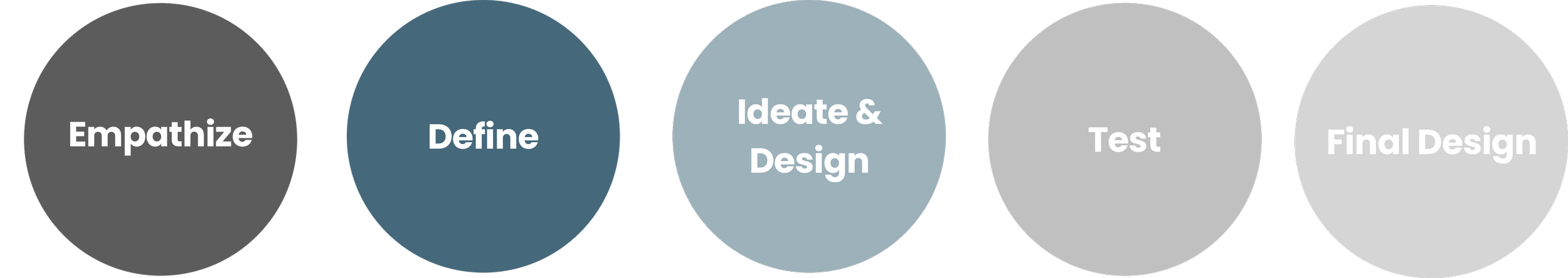
Empathize
In order to understand the problems, we need to understand the users
Who is using this platform? What do they want? What do they need? What questions do they have? What are their current assumptions? What are their frustrations?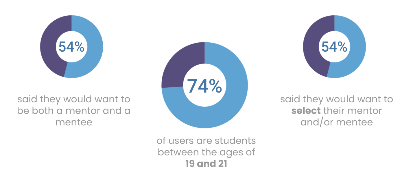
Define
What is the problem we are trying to solve?
What are the goals of this platform? Why would users use this platform? What will keep users using this platform? What is important?
Survey Insights
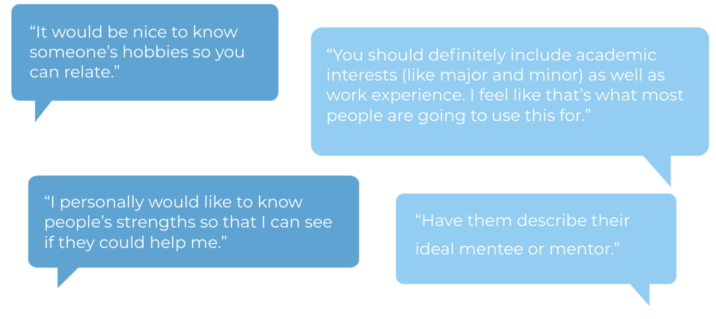
The most important criteria when looking for a mentee or mentor were academic interests, career experience, hobbies, and age
The most common goals people had as mentees were to prepare for career opportunities, learn from someone more experienced, and explore topics of interest
The most common goals people had as mentors were satisfaction of helping a student reach their academic and professional goals and leadership experience
“I value someone who is truly invested in helping their mentees for the right reasons rather than for personal attention or success.”
“I value someone who wants to learn and is genuinely interested in what they say they want to get out of the mentor/mentee relationship.”
Competitive Research
What are other applications doing?
At this point, I had a pretty clear understanding that I wanted to design a mentor/mentee matching app that allowed the user to input information in order to select a mentor and/or mentee that were most compatible. Now it was time to look at other pairing apps to see what works and what doesn’t.
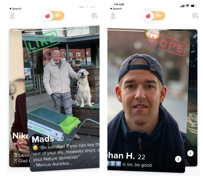
Tinder
Fast and impulsive
I chose to look at Tinder because like my mentee/mentor app, it matches people based on mutual interest
Pros:
Quick
Mutual
Cons:
Quantity over quality
Impulsive
Selective choice (don’t get to compare across others)
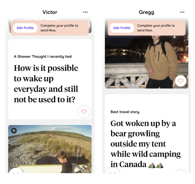
Hinge
Thoughtful and decisive
I also looked at Hinge because as Tinder’s counterpart, I wanted to understand the effectiveness of the differences
Pros:
Thoughtful (not as superficial)
Mutual
Quality over quantity
Tests for compatibility
Cons:
Selective choice (don’t get to compare across others)
Determining the User Flow
What are the steps involved in finding a mentor/mentee?
As a Mentor:
Sign up
Answer questions
Accept or ignore mentee requests
Match with a mentee!
As a Mentee:
Sign up
Answer questions
Choose from compatible mentors
Request a mentor
Match with a mentor!
54% of users said they would wanted to be both a mentor and a mentee, so it was important that I made that feature possible in my design
Ideate & Design
What can we do to solve the problems?
How might we ensure the mentorship is mutual? How might we ensure mentors are a good fit for their mentees? How might we create a way for users to be both mentors and mentees?
How Might We….
Attempt to solve the users problems?
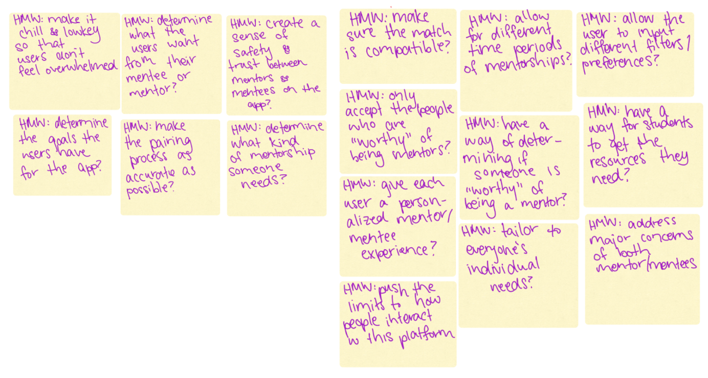
Brainstorm…
Aiming for quantity over quality…
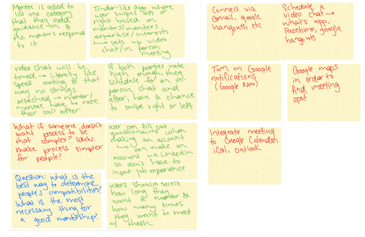
Wireframing
How can we design to best suit the user’s needs?
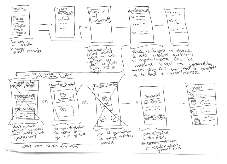
At this point, I started sketching. I knew I wanted my app to have the functionality to allow students to become a mentor, a mentee, or both if they desired, so I started thinking of ways I could implement this.
I also knew students wanted to be able to select their mentees/mentors so I came up with the idea that the mentee would request a mentor, and the mentor could accept or ignore the mentorship request.
Low Fidelity Wireframes
At this point, I was just trying to get thoughts on paper — I wasn’t aiming for neatness
Final Pages
Discover
Discover compatible mentors/mentee requests and choose from them
Events
Book meetups with mentors/mentees
Messages
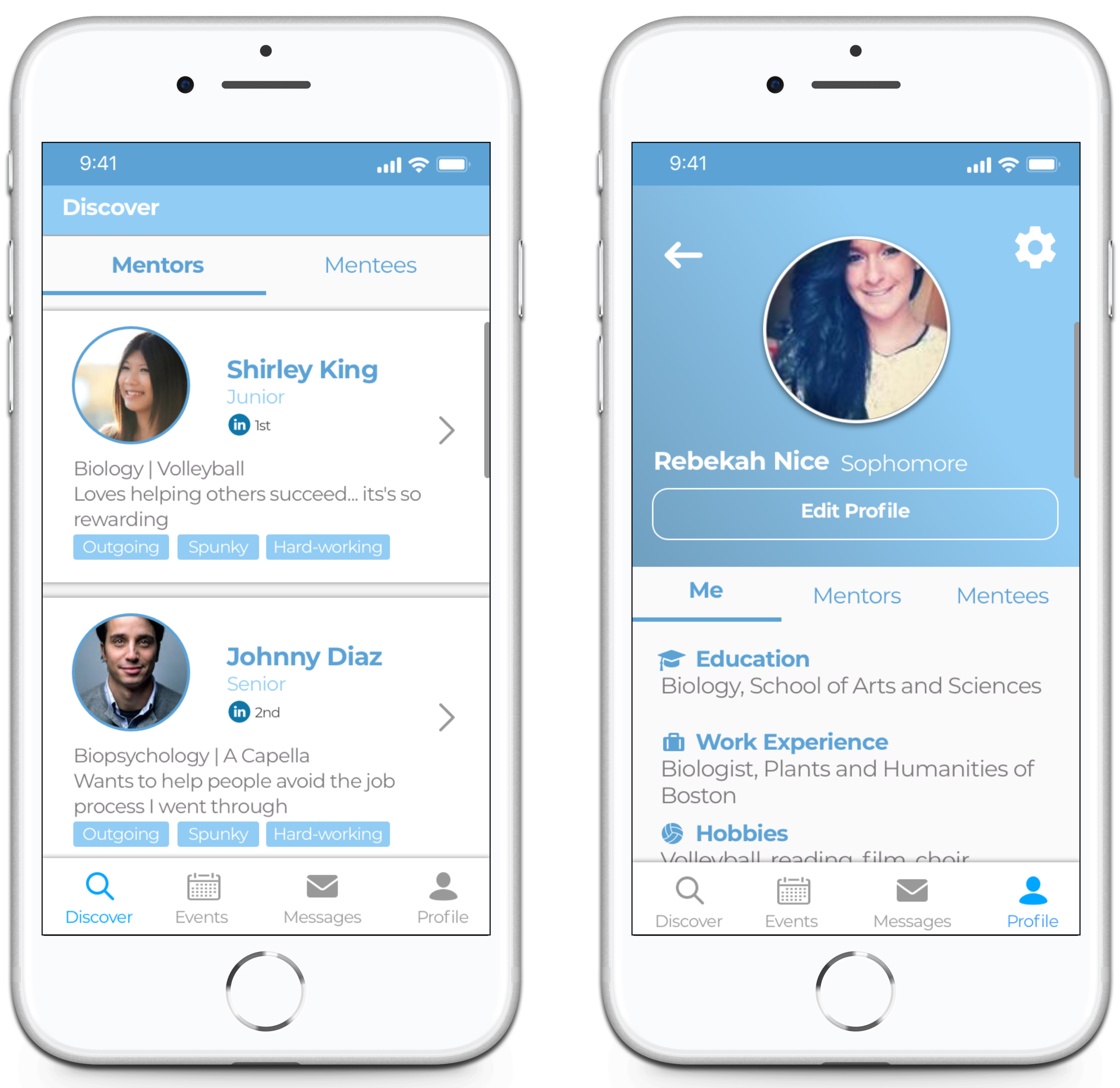
Profile
Your information
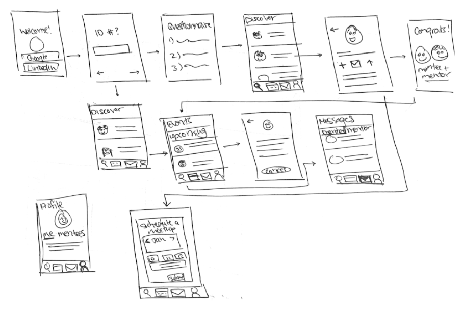
Final User Flow
User Testing
How can we best design for the user?
Once I decided on my final user flow, I did some testing to determine what items were necessary and what were unnecessary. Was there anything missing? Were my users going to find everything they needed? What could be more helpful? What could be more usable?
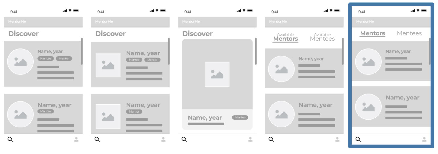
Discovery Page Iterations
Each discovery page offered something different and I wanted to see which would suit the users needs the most. After guerilla testing with five random users, I was able to finalize the final design.
Inclusion of an “Events” Page
After guerilla testing my prototype with five users, many of them described that they would love to be able to schedule meetups with their mentors and mentees in-app so they wouldn’t have to be responsible for it on their own.
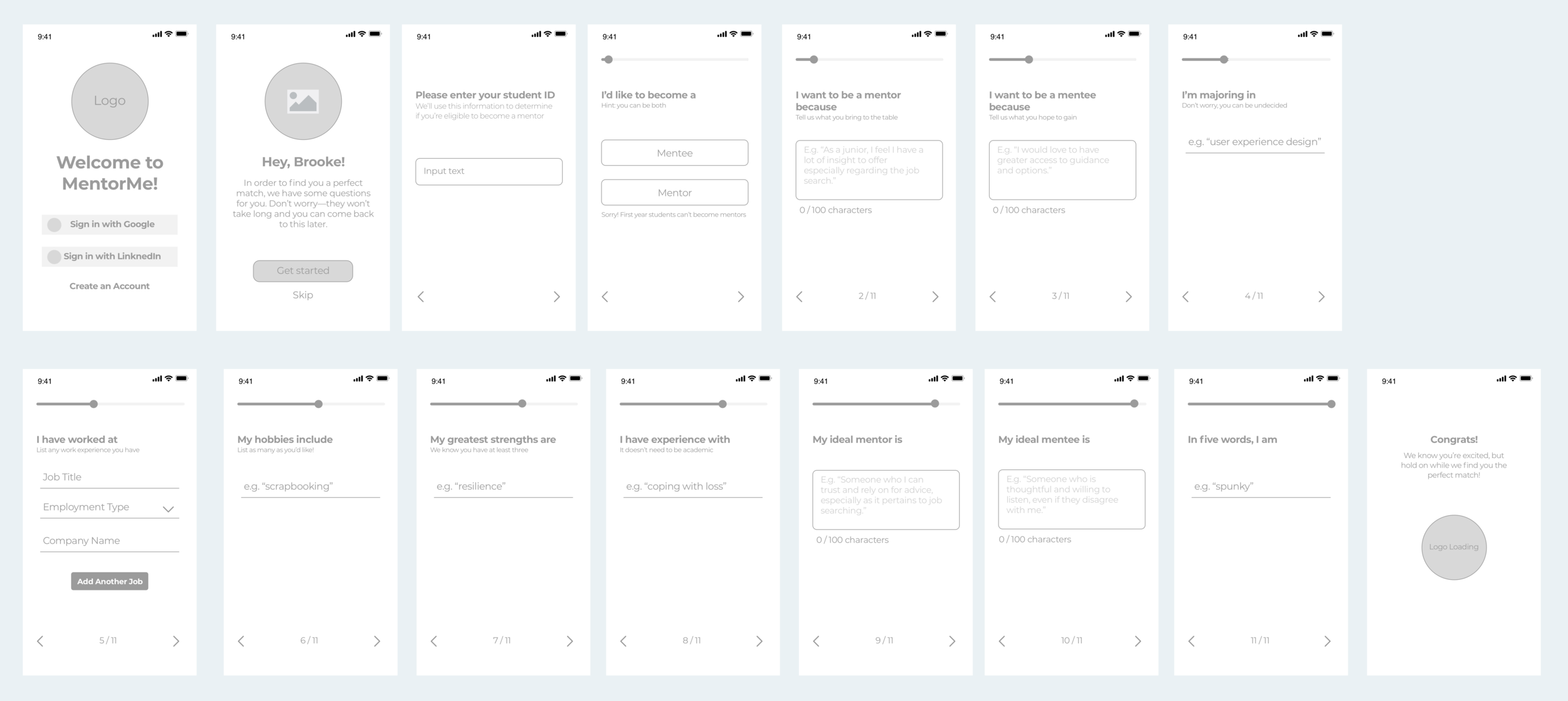
Designing the Questionnaire
I wanted to figure out what users were looking for when deciding on their mentee and/or mentor, so I could include these questions in the initial onboarding questionnaire. I recognized that if the onboarding process was too long or too tedious, there would be a significant drop-off in users, so it was important for me to be selective and specific when deciding what I was going to ask. I ultimately decided on 11 questions that targeted the user’s intentions, goals, personality, and experience.
Final Questionnaire Flow
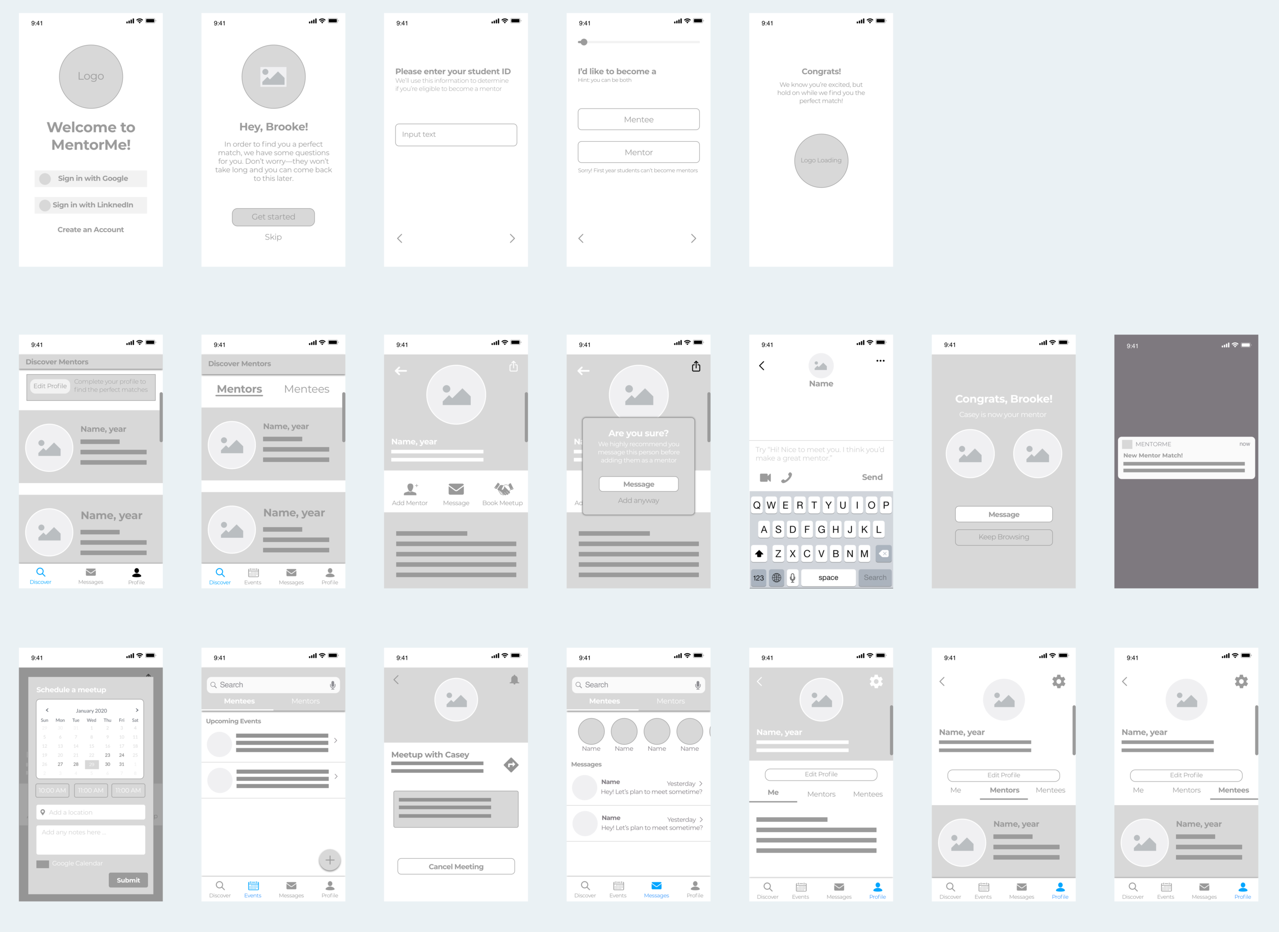
Final Design
How can we make it look and feel like the real thing?
At this point, I was ready to design the final high-fidelity prototype. I had narrowed my app down to include what I believed (and backed by user research and user testing) to be the most fundamental functions of a mentor/mentee app.
MentorMe
The app that pairs you with your perfect mentor or mentee based on your needs, on your terms
How it works
Students sign up, answer some questions, and are provided with a feed of their most compatible mentors. Simply message and request a mentor and await their approval.
Only want to be a mentor? No worries, your feed will consist solely of mentee requests.
Only want to be a mentee? Great, your feed will consist solely of available mentors.
Want to be both? Awesome, you can toggle between either at any time.
Onboarding Process
Answer some questions to find a mentor/mentee match or come back later
Login with your LinkedIn or Google accounts with ease
Select whether you’d like to be a mentor, mentee, or both
Enter student ID to confirm eligibility
Questionnaire
The purpose of these 11 questions is to reveal the personality traits and interests of both mentors and mentees to create an algorithm that produces a feed of compatible mentors.
Discover
Once the users complete the questionnaire, they are able to browse through compatible mentors on their discovery page
If the user is both a mentee and a mentor (as is the case in my prototype), they can toggle between compatible mentors and mentee requests
Users will be able to browse mentors, but unable to request any until they complete the questionnaire
Mentor Profile
The mentor profile is what pops up when users click on a mentor in their feed. Here they can see the mentor’s LinkedIn connection (if applicable; this tends to create a more vested interest in their mentee) major and minor, work experience, hobbies, expertise, strengths, and why they became a mentor and/or mentee.
The user can then message the mentor (the app recommends this before adding a mentor), book a meetup based on the mentor’s availability, and finally, request the mentor.
Finding a Mentor Match
The following screens illustrate the process of matching with a mentor. Once the user messages the mentor at least once (or so we advise), they are able to request them.
Provided that the mentor accepts the request, the two are matched!
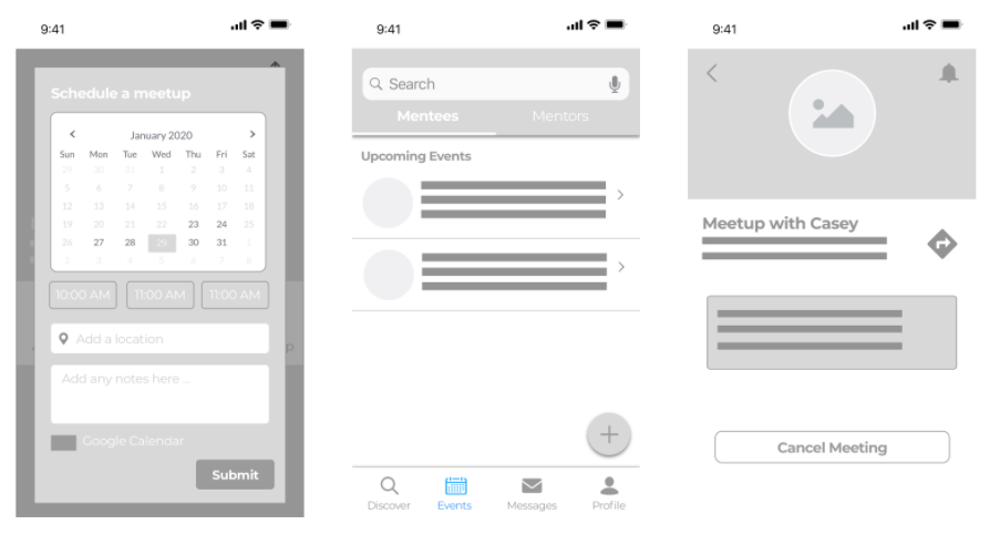
Events
Here the user can schedule a meetup with a potential or existing mentor. The planned events will live in the “events” tab, and the user can toggle between events with their mentees and mentors.
The user can also add additional events if he or she so desires.
Toggle between your events with your mentees and mentors
Plan an event with your mentor and/or mentee
Plan an event with your mentor and/or mentee
Messages
Users can message their mentees and mentors whenever they want, or video chat with Google Duo if they prefer!
Toggle between the messages with your mentees and mentors
Notifications
The notifications on this app are some of the most important features, especially for lazy students (which constitutes a good amount).
They allow the user to create their profile and sit back and wait until a perfect match comes along and falls right into their lap.
High Fidelity Wireframe Flow
Sign up, Discover, Events, Message, Profile
Challenges and Takeaways
What did I learn from this experience?
It is unbelievable how much I have learned and improved since I took on my first UX Design Challenge last year in 2019. I feel much more comfortable with every step of the UX design process, especially the research. A year ago, I would have dove in head first to the colored prototypes, but this year I really made it a focus to stop and reevaluate at every step.
The time constraint on this project was certainly a challenge, but it’s an extremely important skill to be able to prioritize and work efficiently. This remains one of my all-time favorite projects, and is one I am very proud of.
View My Other Projects
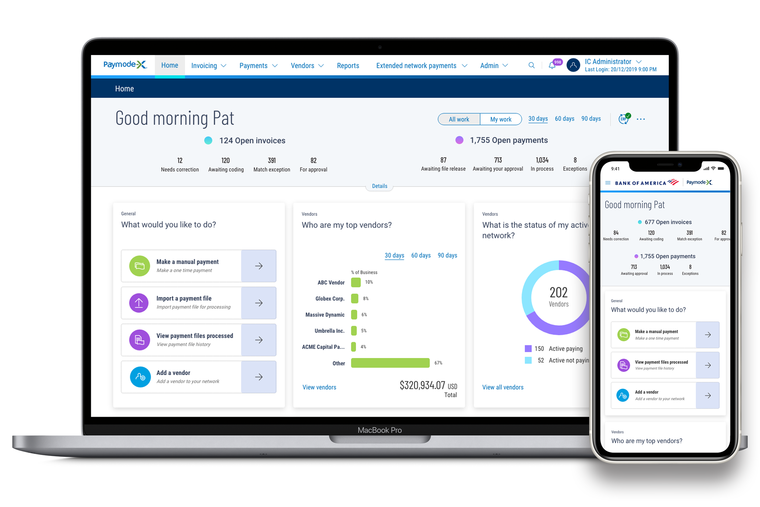
Paymode-X Payer Mobile App
End-to-end Mobile Application | Marketing
Paymode-X Homepage Redesign
Desktop Redesign
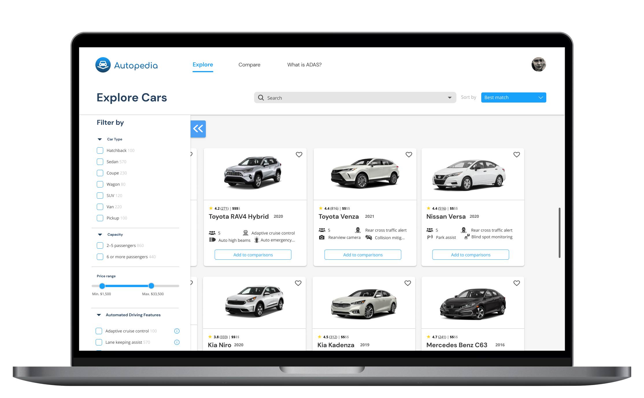
Autopedia
End-to-end Website | Branding